Wednesday, August 15, 2012

honest little plants

air and sea design erin curry succulents floral color palette summer patio Here's a calming and warm color palette for a hazy summer day. The image comes from a home tour found on Design*Sponge. Succulents are very trendy right now, in terms of house/patio plants. They're easy to take care of, they are beautifully lush (a welcome sight, especially in drier climates), and most of all they are aesthetically simple and sturdy.

●●●●●●●●●●●●●●●●●●●●●●●
I think trending revolves around the overall feeling of society, and in financially and politically unstable times, the beauty in simplicity and honesty are more attractive than ever. In the past five years, there seems to have been an explosion of products in the market that are focused on being well-made and reliable. Which is such a wonderful turn of events, as China takes over the world market, creating more waste for landfills. 

A remarkable display of this was witnessed last weekend at the Walden Super Flea (affectionately referred to as the Dirt Mall). Here, you may see a maze of rickety shop stalls occupied by second hand has beens and has nots, operated by white trash mediocrity. A large portion of the flea, however, is now taken up by the aptly named "Made in China" shop. Rows of bins containing molded plastic and cheap steel products with price tags all under $5 fill the space. And it's here, where I see how even the consumerist machine is ashamed of this exploitation. 

-e

Thursday, August 9, 2012

experimentations with color

I have started a new job! It's with a printing company, preparing artwork for screen printing, hot foil imprinting, and laser etching. It's only my first week and it's been a bit of a whirlwind; there's a lot to learn and a lot going on. It's a very large company in terms of output, but our location in the US only has five people occupying it (it's based in Toronto), so it's actually very homey. I have been working on items for Nike and New Balance, as well as some safety wear companies and municipalities. Soon I'll be working on a project for Dead Mau5. I'm working on Illustrator mostly so I feel right at home with it. It's my first real job, and I'm hoping it stays interesting! 

Aside from the 9 to 5, I've been putzing around on Illustrator at home. I had a few color palettes that I threw together after finding some really lovely images in the blogosphere, so I put them all together in one design. It's color overload and that's what I love about it ;)


geometric color pattern textile upholstery
© Erin Curry airandseadesign.com

Tuesday, July 31, 2012

nom

model belgium apartment vinyl record couch velvet cactus colors
Add caption
This image includes three of my favorite things. Vinyl, cacti, and mustard yellow. The image comes from the Antwerp apartment of Belgian model, Anouck Lepère. The colors are sumptuous and savory. 

Swoon.

-e

Wednesday, July 25, 2012

blossom


edie campbell model jalouse floral flowers styling  I stumbled upon these images this morning and fell in love with this model, Edie Campbell. This is an editorial in Jalouse magazine from February of this year and the piece highlights these succulent floral digital prints. The styling is what caught my eye initially; I fell for the mixture of tousled hair and pristine blossoms. (I did some Photoshop magic on them to give them a little spice... I need all the practice I can get). This blazer to the right is amaze-balls. That turquoise color makes my heart skip a beat. 

In other news, I got a job working for a printing company in the lovely Niagara Falls. They specialize in reflective ink and vinyls, and have a worldwide patent on a new heat transfer technology (which is pretty cool). I'm a really basic designer and just prep designs for print but HEY, it's something. And stay tuned for more items to be sold at August's First Friday!! ;D

edie campbell model jalouse floral flowers styling edie campbell model jalouse floral flowers styling

-e

Friday, July 20, 2012

pic•nic


In preparation for August's First Friday & the Infringement Festival, I wanted to introduce a new project that is super easy to do, as well as inexpensive to create. However, for those who don't have the DIY bug, I will have a few for purchase on August 3rd in front of Indigo Gallery along with my posters and shirts. 

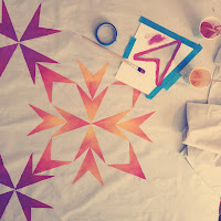
My mother bought me a few packages of very large painter's drop cloths almost a year ago thinking that I might be able to turn them into hand-painted floor mats. My whole senior year later, I finally have time to experiment with them! Painter's drop cloths are very inexpensive, very large pieces of canvas used to protect the floor when painting a room. They also have a very thin layer of waterproofing on the bottom to prevent any paint from seeping through onto the floor below. I saw on one of my favorite blogs (designlovefest - a true inspiration) that they were transforming the drop cloths into colorful picnic blankets using spray paint! I thought I would take it a step further and make a more intricate design with more involved painting techniques. (This isn't the most original project but it's super easy to do yourself, again very inexpensive to create, and very useful!!) 

erin curry diy picinic blanket airandseadesign

I started by measuring out the desired size of the picnic blanket. One of my drop cloths is very long and thin (46"x120") so I stuck with the width at 46" and squared it off with another 46". This is a near perfect size blanket for two to three people and some snacks :). I ironed the whole piece so that the surface would be easier to stencil and paint on. I then started sketching to see what kind of design I wanted. For my first piece, I wanted to stick with something very simple and utilise one shape in my design that could be repeated and manipulated.


I made this stencil of the shape I was using for my design. It is made from Bristol Vellum paper. Bristol is a thick, smooth paper that is used mostly for mounting but it works well for stencils because it doesn't immediately become saturated with paint, thus compromising the edges of your design. I edged it up with some blue painter's tape to make it easier to tape down to my surface without ruining the stencil. 


I wanted a concentric design and found some inspiration from quilt designs; they are generally very geometric with simple repeating layouts so it was perfect for this project. I used a Singer Disappearing Ink marker so I could map out my design first and get an idea of what it would look like. I found the center of the cloth, and worked me way out from there.   


After some trial and error, and making a lot of marks, I decided on my final design and darkened up some of the lines so that it was easier for me to decipher when I started painting. Don't be afraid to use this marker and lay it on thick!! It is one of my favorite tools in my studio and it really does disappear after about 24 hours or a good wash.


After completing my layout, I then had to decide what colors to use (this is always a big ordeal for me). Lately I have been really in love with purples and oranges and how they interact (this is also evident throughout my senior thesis show) so I chose yellow, orange, red, and purple. I knew I wanted to create an ombre look within the geometric shapes to spice it up a bit so an analogous color scheme was important! I am using acrylic paint because after it dries it is NOT water soluble, meaning it will not come off in the wash. You may also use latex or enamel house paint if you have that lying around. 

To the right are the colors I mixed. Word to the wise: NEVER use the colors right out of the tube. Those colors are like that for a reason; they are highly saturated and true colors so that when mixing colors, you are able to do so with more accuracy. All of the colors you see on this piece were mixed using at least three or more colors (believe it or not). All of the colors needed to be mellowed out and in order to do this I added the COMPLEMENT of each color I was mixing - opposite colors on the color wheel. For example, to tone down orange you add a very tiny amount of blue. Or to tone down purple, add a VERY tiny amount yellow. This will allow you to attain unique colors, and colors will live much happier together :).


To begin painting, I placed my stencil on the canvas in the middle of the design and taped down the edges with more blue painter's tape. I used a large brush and put the paint on relatively thick since the canvas really soaked it up. Some dabbing may be required to really cover the surface of the canvas. To get the ombre look, I started with my lightest color and moved up in stages from there. Use light brush strokes to mix the two colors together and never let the paint dry before you get to blend them. I wouldn't use more than three colors at a time within one stencil. The space isn't large enough and you'll end up with some really muddy colors. 


erin curry air and sea design airandseadesign picinic blanket diy paint geometricRepeat these steps with the stencil over and over until you complete the design. I changed around the direction of the ombre but kept it symmetrical. Don't be afraid to experiment with this technique; change around the proportions of the colors or the direction of the fade. I never really had to clean off my brush since the colors were all blending together anyway. Half way through, however, I did have to make another stencil because my first one was getting soggy and I was having some bleeding around the edges. 


erin curry air and sea design airandseadesign picinic blanket diy paint geometric

And voila!! Here is the final product. I stuck the whole piece in the washing machine as soon as all the paint was thoroughly dry (which took a few hours) and then hung it up to dry outside!! The disappearing marker disappeared and it softened up the canvas a bit. I added some white details in the corners and I'm really liking how it looks against the natural canvas so I think I will be expanding on that. 


It is a bit rainy here in Buffalo, or else I would have gotten some action shots of it being utilized! Hopefully on the next sunny day I can take it over to the park for a nice late lunch by the lake. Oh and there's my little dog Arrow trying to get into the picture. Hope everyone enjoyed this super simple project :)
-e

Wednesday, July 18, 2012

decisions, decisions

Photo by Alex Kisilevich
So I've run into a trifecta of last-minute decisions making problems over the past two weeks. I went to Camp knowing of the decisions I had to make upon my return, but I turned off the real world for a few days and now I'm right back in the ring. I have to decide between a job that I somewhat recklessly accepted a month ago, which pays less than minimum wage but makes up for in enriching experiences; and a position in a large company that I may be offered today, which is in the textile field with room for advancement. I hate to be identified as someone who cannot follow through with commitments but something in my gut is telling me that I must stay focused on my field. (That is how I feel right now -->)

On a lighter note, I will be participating in the First Friday/Infringement Festival of Buffalo on August 3rd (by the way they desperately need a redesigned website). I will be stationed, with my DIY goodies, in front of Indigo Art Gallery at 74 Allen St. I am really excited about this opportunity to get my stuff out there, especially since I will be working with such an amazing gallery. I hope to see a lot of familiar faces discovering new art at the Infringement Festival; it is such an amazing event for local underground art. PLEASE check it out!! 

I'll be making more pillows, crafting a better way to display my posters, and hopefully getting more t-shirt designs out there.

-e


Wednesday, July 11, 2012

off to camp


My boyfriend Clifford and I are returning to Camp Bisco this year, doing a solo mission for the Moon Unit (along with Ailsa the wood nymph). I am so ready to check out for a few days. No electricity means no cell phone, no computer, and especially no internet (Okay maybe some Instagram...). These pictures of jet trails over London really hit home for me right now. They are extended exposure photographs of the sky at dusk by Joel James Devlin. The aloofness and serene quality of them are untouchable. 

I've been listening to this band Rubblebucket a LOT the past week (I will admit that I get addicted to specific artists and vastly exploit them for a week or two). Their remix album of Omega La La is UHmazing. Check out one of the tracks below... I'll be seeing them on Thursday at 5pm on the Main Stage ;) 


Also check out the high res images of these jet trails on his website. Breathtaking simplistic detail! 


Sunday, July 8, 2012

real men wear scarves

Burberry Men's Spring/Summer 2013 : Sartorialist
 I ran into these images on the Sartorialist a few weeks ago and the prints made me stop and stare. This is Burberry Men's Spring/Summer 2013 line and I am amazed at Burberry's ability to create something so fresh and so familiar at the same time. The composition is reminiscent of retro silk scarves: simple, colorful and exceedingly geometric. There is something to be said for simple textile design. 


 Sartorialist
You could make the mistake of saying these prints are busy and hard to actualize on the street but the way Burberry mixes the statement designs (jacket), with smaller coordinate designs (tie and shirt) creates a glorious path for the eye to move around in amazement and comfort.  


The colors are spot on, and of course that makes me melt.This is a splendid statement for the upcoming Spring season, and I can't wait for the design to trickle down to the waiting masses. I am starting to question that metallic magenta man clutch down there on the right however... I'm going to be honest and say I was so entranced by that purple jacket that I barely noticed it until now.


Despite the bag, I hope all dapper gents out there adopt this magnificent trend. Now I have to stock up on YSL silk scarf design inspiration. 


-e

Thursday, July 5, 2012

floral goodness

instagram lantana flower air and sea design airandseadesign erin curryI have been hanging out in gardens a lot lately and the lovely Lantana flower struck my fancy. I fell in love with the colors and geometry of the maturing petals. The flowers move through phases: each stage becoming more beautiful than the last. The image to the right shows the Lantana just before opening. Below are the blossoms, effortlessly and elegantly transitioning from one hue to the next.

erin curry lantana flower air and sea design airandseadesign instagramFlorals have always and forever been a major corner of the market in textile design. They have been done every single way in every single style so it is very hard to conjure up a fresh look with florals. That is where personal style comes in. Anatomical representations of flowers don't require much consideration when you already possess the drawing talent, so personal style is where you can earn some originality points. 


erin curry airandseadesign air and sea design floral watercolor textile design
I whipped out my watercolors and started playing around. I wanted to abstract the shape of the flower and maintain a free-hand look. However to highlight the strong geometry of the bud seen above, I created a more synthetic looking motif to lurke in the background (literally). I wanted to preserve the watercolor elements, so I placed the motifs on the original texture of the paper. The evolving coloration in the petals translated perfectly into the loose watercolors. 

This is a very basic repeat setup, and the beauty of Computer Aided Design (CAD) is that I can create 30 more samples using these motifs with much less effort than with a hand-drafted pattern. I expect to take these motifs a little further, creating a more intricate design as well as smaller coordinates. Maybe I'll throw in a stripe if I'm feeling giddy. It feels amazing to get back into painting; I haven't dedicated this much time to painting in months and months (there was quite a dark period there, post-stolen-gouache).

I have some crafty projects that I have been working on, requiring a few posts, so until next time..
-e

Sunday, July 1, 2012

originality

From the beautiful site: steep street
I am really excited to say that I may be involved in another art fair the first week of August (!!!). I have been trying my hardest to get back into the groove of creating, however it isn't as easy as it sounds. After five long years of having my studiomates around to bounce ideas off of, my little studio here is feeling a bit lonely. 


I met with my good friend Kelly yesterday to drink some cold beers in the park, and of course we got to talking about design. We both are very driven to work with our hands and we continue to throw around the notion of further collaborations. But we began discussing how to keep going and how to stay true. I see a lot of crafters jumping on bandwagons and following trends, identifying what sells and what doesn't. I guess you could call it selling out, but I'm talking on a very small level: crafters like me who are trying to find a voice but also want to make a dime doing it. Can you, as a crafter, justify recreating some pieces you saw on Etsy or at Anthropologie ( and that is a whole other box of worms that I will open at another time) because you know they will sell? 


And this is where I find myself. 


Friday, June 29, 2012

finding ingenuity


One of my favorite past times is hunting for inspiration. It is necessary as an artist, craftsperson, creative, what have you. I find that historical sources make up a lot of the inspiration I use in the pieces that I create. And one historical source that I come back to time and time again, is the work from the Bauhaus school. 


At the school, there was a weaving studio. From that weaving studio, came the first female master craftswoman the school had ever seen: the lovely and perplexing Gunta Stölzl. She was a forward-thinker, wearing trousers and puffing on cigarettes, unapologetic and confident. She celebrated color and understood the beauty in subtleties. She revolutionized the design world for women and for that I owe her eternal gratitude. 


These portraits of her, done by a fellow Bauhaus master, show her in a light that not many might see when viewing her craft. Her work is clean and geometric, following the values set forth by the founder of the Bauhaus school, Mr. Walter Gropius. She pioneered the modern age of weaving, although not entirely separating it from the centuries old tradition it grew from. 
Tapestry by Gunta Stölzl, 1923
African Chair by Gunta Stolzl and Marcel Breuer
Office of Gertrude Stein with works by Gunta Stölzl

Other amazing female craftswomen from the Bauhaus include Anni Albers, Marianne Brandt and Otti Berger. Do some research and feel inspired! :)


e:


Thursday, June 28, 2012

long-lost wovens


woven design modern textile air and sea design airandseadesign erin curry
While in Toronto, I visited an old friend from FIT: the beautiful Valentina with her fiance Jeff. She had snagged some woven pieces for me after graduation (which was the last time I saw her; much too long since) and has been keeping them safe for me for the past two years. They are some of my favorite pieces and were featured in the Art & Design Graduating Student Exhibition at FIT in 2010. Anyway, I am SO SO happy to have them back and I wanted to share! Oh how I miss the weaving studio at FIT...


woven modern air and sea design airandseadesign erin curry textile


The wovens shown here utilize an ombre warp with a spike of red down the center. These two samples look very different but they were both part of a larger experimentation with twill weaves on an eight-harness table loom. I fell in love with weaving because of the focus on color and structure. I love all the rules! Which is something I would never normally say. The creative process morphs into something completely unexpected when a loom is at your fingertips! 

e:

Tuesday, June 26, 2012

weekend jaunt to toronto

vintage textile instagram toronto floral geometric air and sea design
As a Buffalonian, I am familiar with Canadian customs and I find myself identifying with their ways. Toronto is a beautiful city, clean and polite, having an excellent juxtaposition of old with new. Things are noticeably slower than New York; time seems to be appreciated, as well as togetherness.

erin curry air and sea design instagram vintage textile toronto floral geometricThe boyfriend and I went up for the weekend with little money and most every meal was Tim Hortons. Despite the lack of funds, we did some great sightseeing and people watching in very real neighborhoods. The Kensington Market and Queen West are two amazing little pockets west of the University. Kensington has some great vintage emporiums and plenty of hippie-chic garb. Queen West on the other hand is home to a handful of flawless design stores, hip tattoo shops, and drinkeries akin to the LES.

Overall the trip was a welcome break from the monotony of dull side jobs and slowly picking the pieces of my life back up. Hopefully it won't be long before another visit considering the drive is under two hours! I am also considering fishing for a design position up there... we'll see what bites.

e:

Sunday, June 17, 2012

crafts crafting craft

Hello all!

I attended this GREAT indie craft market called CLUTTER today down on Essex St. here in Buffalo. It was a bit slow for most of the day due to the fact that it was Father's Day; regardless I met some amazing people making truly lovely things! I love seeing creative people making things happen here in Buffalo and it truly inspires me to keep making!

air and sea design craft erin curry clutter handmade diy homemade textile design
We fought off some sprinkles early on but then had beautiful sun for the rest of the day. We were set in the quaint courtyard of the Essex St. Studios outside the Griffis Studios and Big Orbit Gallery. This was my first market so I learned a lot and I now have a better plan of action for display and setup. 


For next time, I will be adding more pillows and t-shirt designs! I am going to do some dabbling with watercolors in the near future and see how those designs might translate to shirts. I also am going to continue experimenting with bleach and my secret weapon Soft Scrub ;) And of course, I can't wait to see all the wonderful goodies everyone else brings to their tables. 

More to come!! 
e:


Thursday, May 17, 2012

fun with styling


Before I took down the show yesterday, I had my lovely friends Dakota & Sam help me move some things around and make some magic. I borrowed a friends camera to do some DIY styling and then Sam came to the rescue with her amazing photo skills and ideas. I totally appreciated her out of the box ideas and we got some really killer shots, while making the most of the space at Exchange Street. 


All the furniture in these photos was designed and built by the talented Kelly Caruso, so I have her to thank for making all my fabric and wallpaper look right at home. Here we go!


Afterwards we got to spend some quality time on the roof, with a glass of wine overlooking the cityscape. Thanks again girls! I couldn't have done it without you. 


So now that the show has been photographed and taken down, it's back to the grind. I have a new found sense of motivation after hearing all the feedback about the show. And if I can swing it, I'd love to have another one at the end of summer/beginning of fall. 


Until then, I'll be submitting resume's to everyone and anyone that I admire in the design world (There might even be a graduate school application or two...). Thanks again everyone :)

e:


thank you to all that came!!

My good friend Nicole came and did some photography the night of the event, to get some shots of the fun that was had. I'm so glad Kelly and I have this night immortalized so we can always remember just how magical it was. 


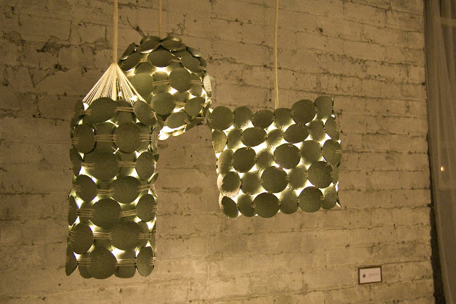
 All the lighting design is by Kelly, as well as that magnificent wall divider. The night really got going right at 7:00pm. We estimated that we had about 200 guests throughout the course of the night, which was so humbling! I am so grateful for everyone that came to support us and our work. 


Thanks again! And there will be much more to come! 


:e